wcag heading
ALL THE DEVILS ARE HERE finds our dear Inspector in France so there’s no better place to kick off our “Gamache Goes Abroad” cover musings than en français!
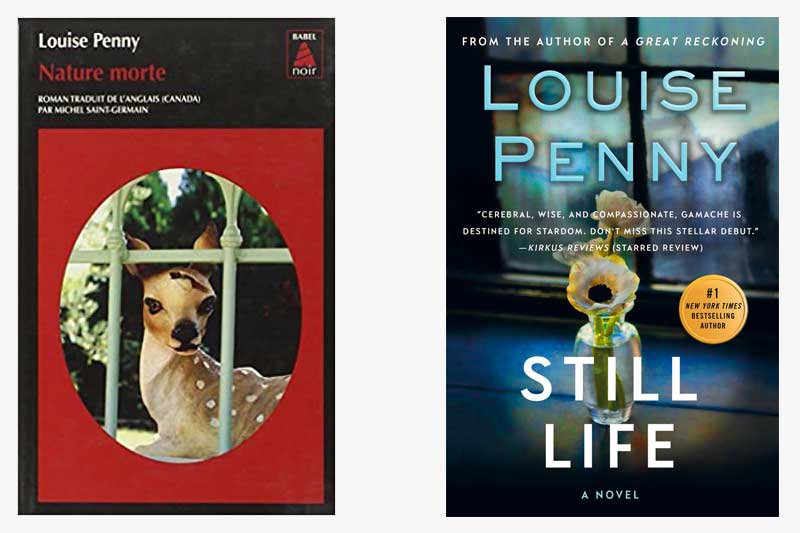
And, wow, the current U.S. cover treatment of Still Life couldn’t be any different from how our French colleagues handled the look of the book. While we opted for a subtle nod to the title — the art genre that dates back to the Egyptians — the French took a more severe route, depicting a key plot point (no spoilers, please!). It’s noteworthy that both covers feature framed imagery which could symbolize a window, or, entryway, into the series.
What do you think?
Which cover do you gravitate towards?


219 replies on “Gamache Goes Abroad: Still Life”
Hmmm…I’m so familiar with the English cover but I’m intrigued by both the cover and the title used by the French…I’m rereading the series to immerse in the imagery and the friends we have found in Three Pines. I’m not an artist but Still Life presents the notion of capturing a moment in time of something that once lived…Nature Morte seems to focus on (literally) the death in all. I think your books focus on life and its quirks and twists and yes, an occasional death – and not just the loss of life – the loss of trust, beliefs, friendships that perhaps weren’t strong to begin.
It turns out that “nature morte” is the precise translation of “still life”, in the painter’s sense of the term. Webster’s defines “still life” as: the category of graphic arts concerned with inanimate subject matter. Still lifes from past centuries often feature food, including such things as dead unplucked pheasants. Most Francophones probably don’t even realize that Anglophones might find “dead nature” repulsive.
Definitely prefer the American version.
Having read the book (all of them!!) I would have to say the American cover is the one I pick. To me, it conveys the entry into the world of Three pines. On the surface quite and peaceful, but we all know or will learn the truth and still want to live there anyway.
I prefer the warmth of the U.S. cover. The cover alone draws me in to this wonderful story.
I like the double entendre of the French version, but the US version is more aesthetically pleasing.
Original version
The US cover is my choice. Much more subtle. (Not something usually said about America!)
American version
I like the American one because it more complex. The use of light and shadow creates an atmosphere. The flowers are light and alive and stand in the darkness surrounding them. It also gives off an aura of mystery.
I prefer the American version because the title grabs your eye first.
I like the US version. To me it’s a softer look that invites me in.
US version
I’m drawn to the French title and prefer the American grafics.
American version is way better. I’m Belgian and I first bought the book in French. At first I was surprised that the title was Still life although the painting was not an actual still life painting.
I like the US cover better, but I think the French cover might be more relevant to the tone of the book.
If I was in a book store the French cover would draw my attention quicker than the US one. Maybe it is the bright red color, blood.
Another vote for the American version. Blue is my color and attracts me more than the red. It’s also a very appealing photograph making me wonder what lies ahead.
The thing that stikes me the most is the book’s title in French- Nature Morte. Translated into English it would be “Dead Nature”.
I like the American version.
The artwork in US version captured me from the get go. I would definitely choose that cover to explore from a book store’s display. I don’t care enough about the realistic artwork from the French cover to give it a second look to find out if I’d like to read this book.