wcag heading
ALL THE DEVILS ARE HERE finds our dear Inspector in France so there’s no better place to kick off our “Gamache Goes Abroad” cover musings than en français!
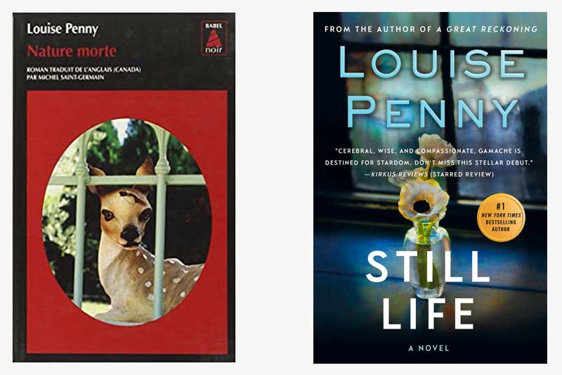
And, wow, the current U.S. cover treatment of Still Life couldn’t be any different from how our French colleagues handled the look of the book. While we opted for a subtle nod to the title — the art genre that dates back to the Egyptians — the French took a more severe route, depicting a key plot point (no spoilers, please!). It’s noteworthy that both covers feature framed imagery which could symbolize a window, or, entryway, into the series.
What do you think?
Which cover do you gravitate towards?


219 replies on “Gamache Goes Abroad: Still Life”
I like the US version.
US version for me.
I like the US cover, just as I like the US titles. I guess I’m a traditionalist at heart.
While the French cover is intriguing, I still prefer the North American cover……
I also like the U. S. Cover. Just something about it that draws me in.
I like them both!
I read on Kindle so it doesn’t matter about the cover.
Another vote for the US version. Its subtile, more complex, lovely.
American version. I like the colors more and the French version tells me there’s a fawn that’s wandering about hurting. I would not have even picked it up.
Us cover
Ahem! I like the Canadian version or we could say the North American version
So different! Maybe after I get to read the book the French version will make sense.
Definitely the French cover…intriguing
I gravitate towards the American cover but I have to say that the French cover is a bit unnerving. Look at the expression on that knowing deer’s face. It gives me the willies!
Of these two I have a slight preference for the English version, but I really prefer an earlier cover that was a bit darker and featured conifers, with three pines in a group clearly silhouetted against the sky.
The US version, for sure. As well as the title.
US version would be the one I chose. It’s not about the cover but the delightful content.
I prefer the US version. It looks like the deer has a bullet hole in it’s head in the French version. I’m a softie. Not keen on dead animal imagery.
While I normally prefer the French version of anything – in this case, the U.S. version. It’s more aesthetically pleasing, softer – a reminder of the gentleness of the victim (though, considering her art work, this would not be her favorite) And while the deer could serve that same function, its depiction here is hard, that gash only serving to “hollow out” the deer. And why the fence?
These are fun to compare. And interesting, too, that the translation of the title is an exact one.
I like the American cover best. And, I love, love, love the Armand Gamache series. I have the new one pre-ordered. Thank you Louise Penny for this series.