wcag heading
ALL THE DEVILS ARE HERE finds our dear Inspector in France so there’s no better place to kick off our “Gamache Goes Abroad” cover musings than en français!
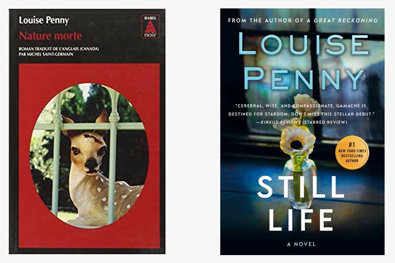
And, wow, the current U.S. cover treatment of Still Life couldn’t be any different from how our French colleagues handled the look of the book. While we opted for a subtle nod to the title — the art genre that dates back to the Egyptians — the French took a more severe route, depicting a key plot point (no spoilers, please!). It’s noteworthy that both covers feature framed imagery which could symbolize a window, or, entryway, into the series.
What do you think?
Which cover do you gravitate towards?


219 replies on “Gamache Goes Abroad: Still Life”
Definitely the American version. The French cover is stark, while the colors in the American cover are softer, which is more appealing to me. Although, the blood red on the French cover, surrounding the soft fawn, might be more appropriate to the story, the softer American cover works better with the title.
I am partial to the American version. Probably because I’ve been so familiar with it all these years.
Definitely the US version
Like most every comment I’ve seen, I like the US version best.
My vote is American. I like the French version; I love the American Version.
The US version. More subtle.
The red n fawn draw me in. The French version.
I have liked the American cover since the beginning. It opens the window for the future while grounding us in the still life art.
Like the English one
I liked the multiple meanings of “Still Life,” as an artistic term and alluding to something still living, or as to a quiet life. So the US version is the one I like.
I like the USA version, but the French version is intriguing.
Final vote French
First impression: The American version is peaceful. The French version is unsettling.
Love the North American version. Transporting
The US version is definitely more evocative.
I think the imagery on the US version is lost with so much text on the cover. I prefer the French version.
Flat, not glad. Spell check fails me again!
I like the American version. More intriguing—-fills more ov the cover. French version is more glad and too red. A great book with either cover!
I like the French cover. It really pops out and draws attention to the book.
I have taken real notice of the US version of still life. The rest of the covers have always intetested me. I like the French better
Hmmmm…hard one. I love the art of the US version but I’m drawn to the French version “looking into and out of” theme. They both have meaning for me after reading the book.