wcag heading
ALL THE DEVILS ARE HERE finds our dear Inspector in France so there’s no better place to kick off our “Gamache Goes Abroad” cover musings than en français!
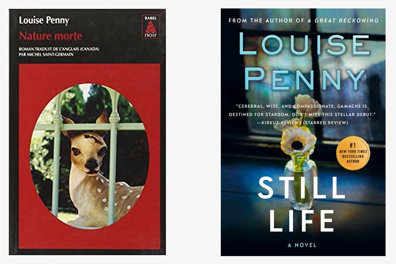
And, wow, the current U.S. cover treatment of Still Life couldn’t be any different from how our French colleagues handled the look of the book. While we opted for a subtle nod to the title — the art genre that dates back to the Egyptians — the French took a more severe route, depicting a key plot point (no spoilers, please!). It’s noteworthy that both covers feature framed imagery which could symbolize a window, or, entryway, into the series.
What do you think?
Which cover do you gravitate towards?


219 replies on “Gamache Goes Abroad: Still Life”
I gravitate towards the American version, not because of country of origin, but because it’s more subtle than the French version and therefore feels more like the series itself. The Inspector Gamache series appeals to me because of the author’s ability to bring humanity and nuance to what is othewise a dark and often grisly subject matter. The residents of Three Pines feel like old friends.
U.S. Cover— Author’s name in large letters is an important — particularly with a popular one like Louise Penny.
And then the American paperback version is totally different.
I really dislike the French version.
I do a bit of painting for my own enjoyment so the American version has always appealed to me. I keep trying to remember how I discovered Gamache but I really can’t remember. Just extremely happy that I did!
The American version. It feels softer and subtle and inviting.
I like the US version because I don’t like the lettering on the French version. The title is almost lost on the cover, instead of the large print on the US cover. And the red makes it hard to read. And the author’s name is even smaller. Maybe it’s a European thing – I have noticed other French novels have relatively small lettering too.
I like the Us cover. It is more in keeping with her previous covers. The aft Christmas cover looks like it should be on a child’s book.
The US cover evokes mystery whereas the French cover is not clear what it evokes!! Please go with the US cover!!
I like the US version. This was my first introduction to your books by my wife and I am a huge fan. I even drove down to Atlanta area to see you and I have read every book and hang on the date and pre-order your books. You have a quality in your books that is elusive for me to express and is so human and compassionate I just want to hang around in them. I am starting to re-read them as I continue to self quarantine. Thank you.
I feel completely clueless – had no idea that a book would have different covers dependent on the country it was published in. And now I have to re-read the book.
US version
I like our cover, it’s more ” Three Pines ” and therefore ” Instector Gamache”
French version!
I find the French version disturbing because of the gash in the head of the (ceramic?) fawn. I probably wouldn’t pick it up to read it. The English version on the other hand is connected to the title. The image and the reference to art make it much more appealing to me.
I tend to go with the US cover but admit the French cover makes me ponder
I like them both, am looking forward to this book coming out. Thank you for writing another.
I like the American cover – nice layout and design.
The French cover looks interesting at first glance, but when examined more closely, it looks a bit garish.
The U.S. version for sure. The French cover is horribly sad. It looks like a dead fawn that has been shot in the head. I’m a nature lover and animal lover. I would never want to open that book if I didn’t know anything about it.
US version, hands down.
I like them both but the French version is more intriguing.
I prefer the U.S. version.