LOUISE PENNY’S

Categories
Postcards

Gamache Goes Abroad: The Nature of the Beast

wcag heading

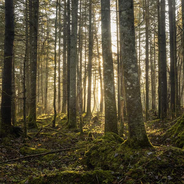
This week, we travel to Gamache’s own stomping grounds as we visit the French Canadian cover of The Nature of the Beast. The first thing we noticed about both the French Canadian cover and our own is the inherent darkness, which reflects Ruth Zardo’s thoughts in this book: that “And now it is now. And the dark thing is here.”

Upon closer inspection, it appears that the two jackets are the inverse of one another. While both depict a dark forest, the American edition shows a group of trees surrounding a space of black emptiness. The French Canadian version, however, shows the opposite: a sunlight group of trees surrounded by darkness on the edges. For those of us who have read the book (no spoilers, please!), we know the significance that the darkness of the forest has on the plot of the book. And both covers certainly convey that ominousness. 

Which do you prefer? 

How else could you convey “the dark thing” in a cover design?


Categories
Postcards

Gamache Goes Abroad: The Long Way Home

wcag heading

The Long Way Home takes us all the way to Romania this week as we examine two different jacket approaches for Louise’s tenth novel. 

The Romanian jacket designer took a very literal approach to the plot of the book, depicting a man, who we would assume is Peter, walking away towards the banks of the St. Lawrence. 

Our version takes a more symbolic approach. Here is designer David Rotstein, in his own words:

The image is by Clarence Gagnon entitled Evening on the North Shore. The painting is from 1924, just before Gagnon left his home on the banks of the St. Lawrence to live in Paris, ‘a long way from home’. Some people don’t immediately see that the image as an upside-down landscape, and only see an abstraction. The back of the jacket shows the painting right side up, helping the viewer realize that it’s one image shown two different ways. Those who do immediately see the front cover as being upside down are likely to interpret the visual as suggesting that things have gone awry, or are not what they seem . . . a home turned upside down. While I don’t intend for people to necessarily notice this one final thing, the inspiration came from the passage in the book when Clara realizes that they have been looking at the painting upside down. I loved Louise’s lines about rotating the painting, and seeing how “day became night…sky became water…smiles became frowns…laughter became sorrow.”
Lastly, the jacket was printed on a textured paper stock which has the appearance and tactile feel of real painter’s canvas. It’s a very unusual surface for a book jacket, and gives the book a very special feel. 

When you first saw the US cover for The Long Way Home, did you notice that the image was upside down?

In general, do you prefer jacket treatments that are more literal or more metaphorical?

Categories
Postcards

Gamache Goes Abroad: How the Light Gets In

wcag heading

There’s a crack in everything. That’s how the light gets in. – Leonard Cohen

This quote first appeared in A Fatal Grace, then inspired the title of Louise’s ninth book, and clearly guides a recurring theme throughout the Three Pines canon. In examining this week’s international edition, from Slovakia, we were struck by the differences in how we both interpreted this quote. 

Our Slovakian colleagues chose to focus on the first part of the stanza — There’s a crack in everything — with imagery suggesting a crack in the floor. They split the quote even further by actually dividing the cover into two parts. 

It would appear that our jacket designer focused instead on the second part of Leonard Cohen’s quote: That’s how the light gets in. On our cover, the light filters through the spaces between the trees to illuminate the snow on the ground.

By each focusing on one side of the quote, somehow both publishers managed to illustrate the symbolism of separation. 

For more on Leonard Cohen’s influence on Louise, click this

What does this quote, in the context of Louise’s work, mean to you? 

Categories
Postcards

Gamache Goes Abroad: The Beautiful Mystery

wcag heading

We find ourselves back in Sweden this week with the cover of The Beautiful Mystery. Of the many foreign covers we’ve explored so far, the Swedish edition is the closest we’ve seen to almost matching ours. In previous posts, we’ve talked about the use of light as a powerful symbol, but these two covers put that idea in the forefront. 

In The Beautiful Mystery, Chief Inspector Gamache travels to the monastery of Saint-Gilbert-Entre-les-Loups, to investigate the death of a renowned choir director. Tucked into the wilderness, the monastery is a beacon of peace and reflection in the dark woods. The light shining through the trees on both jackets might also symbolize the illumination and discovery resulting from Gamache’s investigation. 

Does the Agatha and Anthony Award callout on the top of the Swedish jacket bring a movie poster to mind? What actor would you pick to play Gamache? 

For more information on the real place that inspired the monastery in The Beautiful Mystery, click this. 

The owner of this website has made a commitment to accessibility and inclusion, please report any problems that you encounter using the contact form on this website. This site uses the WP ADA Compliance Check plugin to enhance accessibility.