wcag heading
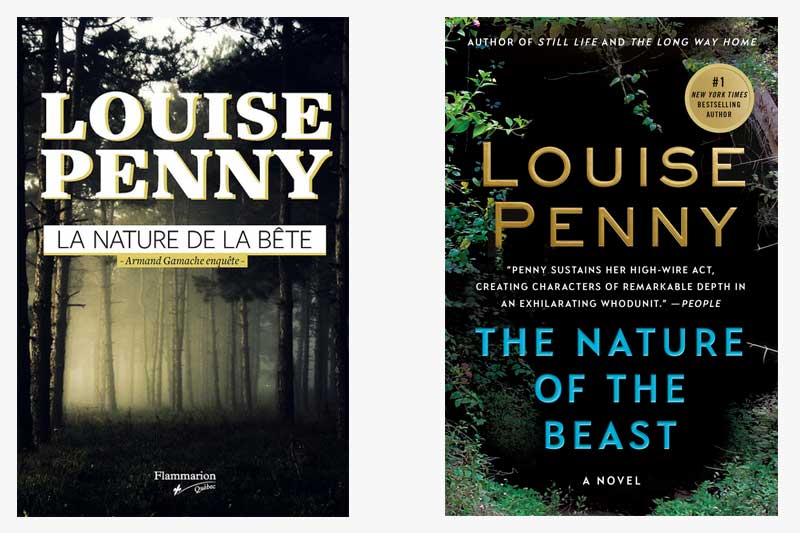
This week, we travel to Gamache’s own stomping grounds as we visit the French Canadian cover of The Nature of the Beast. The first thing we noticed about both the French Canadian cover and our own is the inherent darkness, which reflects Ruth Zardo’s thoughts in this book: that “And now it is now. And the dark thing is here.”
Upon closer inspection, it appears that the two jackets are the inverse of one another. While both depict a dark forest, the American edition shows a group of trees surrounding a space of black emptiness. The French Canadian version, however, shows the opposite: a sunlight group of trees surrounded by darkness on the edges. For those of us who have read the book (no spoilers, please!), we know the significance that the darkness of the forest has on the plot of the book. And both covers certainly convey that ominousness.
Which do you prefer?
How else could you convey “the dark thing” in a cover design?


13 replies on “Gamache Goes Abroad: The Nature of the Beast”
While I am not a fan of the font used for Louise’s name in the French-Canadien verision, I like this cover so much better than the American cover. I think it is true depiction of the body of work – how the light shines through darkness. The American cover does not tell me about what may be inside the covers. And, as usual, the American cover has too much language. Hear that Minotaur?
I like the French Canadian cover. I like that as you look into this deep forest – there is light at the end of the story. You know that murder and deep grief will show up, but hope is always at the end. Love Louise Penny – hopefully by next summer I can make a trip to Three Pines.
To me, the North American cover seems much more menacing. What is lurking in that darkness at the heart of the cover?
The French Canadian version speaks to me of melancholy. It foreshadows an ominous scenario and this time I would choose this cover. Now, if I was only able to read French. Thanks again for this Louise. ☮️
For me the American edition showing an ominous dark interior is rather symbolic for the current situation we face with the pandemic raging inside our country. Apropos.
French Canadian version shows that the light gets in…I always look for how the light is played in Louise’s books!
I prefer the French version; the incipient mystery lurking in the dark shadows, while the light as knowledge/truth offers stability and redeeming values of continuing to expose truth in the darkness.
To me, the cover of the American edition captures my mental image, made possible by Louise’s vivid descriptions, of the initial site of “the beast.”
Wow. Both convey that eerie feeling of impending doom. In dark versus light I am left feeling like something dangerous is lurking within, just beyond. And with the darker version I am standing on the precipice of the deepest part of the forest, my heart pounding. I can’t decide which version is better. Both convey that same feeling. It’s a tie for me.
Everyone’s responses are very eloquent. I protégée the French Canadian version. More thought provoking…
The French Canadian Cover to me, seems as if the outside world is being watched by the dark . . . something evil lurks outside the light. The other cover is looking into the dark from the outside. I prefer the second cover because I would like to think we live in the light but can examine the dark but not dwell in it. This cover also to me, speaks of the beauty of the community even while it examines the darkness within some of the history and background of the characters.
Wow, both covers are a great reflection of the core plot of The Nature of the Beast and certainly lead the reader to anticipate darkness and possibly dread. The fear of the dark is a strong and primal urge.
The French Canadien version has won out for me because at the edges there is still light, still hope.
In John 1:5: “The light shines in the darkness, and the darkness has not overcome it.”
For me the French Canadian cover conveys the yin/yang nature of light and dark. That tiny dot of light on the left side of the cover within the trees inspires hope and sense of moving through. The American cover presents an either/or perspective.