wcag heading
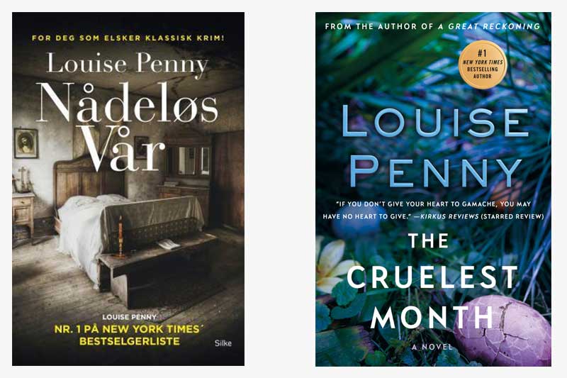
Today, in “Gamache Goes Abroad,” we visit the Norwegian edition of The Cruelest Month. As you might remember from the Cultural Inspirations we did about this book, the title directly references the T.S. Eliot poem “The Wasteland.” In the book, Gamache reflects on the nature of the poet’s idea that April is the cruelest month. The American cover clearly represents April with its Easter egg imagery, but the one cracked Easter egg in the corner suggests something sinister as well.
In contrast, the Norwegian publisher chose to focus on an image suggesting the inside of the Old Hadley House, where some villagers celebrated Easter with a séance in this book. While the American cover uses pastel colors commonly associated with spring, the Norwegian jacket is done entirely in a muted, dark, and mysterious color palette.
What do you think about the two different covers?
Which cover better encapsulates your feelings about Louise’s third book?


68 replies on “Gamache Goes Abroad: The Cruelest Month”
I like the American cover better; it is more inviting while the Norwegian cover tends to make me depressed before even opening the book.
I prefer the Norwegian cover – the colors and feel of the room draw me in.
I much prefer the US cover that more closely follows the previous covers.
I like the colors in the Norwegian cover but the content of the American one. The cracked egg is thought provoking.
I like the bleakness and brooding of the Norwegian cover, but the broken egg in the US version certainly goes with the idea of cruelty.
I like the U.S. cover much better, partly because of the color palette, and partly because of the symbolism. Also, I didn’t think the Norwegian cover really represented the old Hadly house very well. An outside picture might have been more effective, since everyone in the book tries to avoid even looking at the old house.
Definitely the American version. It’s much more evocative. The serene loveliness of spring captures the charm of the village and the people within, while the cracked egg suggests something sinister afoot. The Norwegian cover is too dreary and would not inspire my interest in reading the book.
You can always tell the USAmerica bookcover. The name of the author is always bigger than the title of the book. I never imaged the interior of the Hadley house looked that good. I like the subtlety of the egg cover best.
Interesting comments! The Norwegian cover would put me off from reading this book if I wasn’t familiar with Louise Penny and Three Pines. It’s appearance is too dark. I think that the thing that keeps me enthralled with this series is while there are very dark and sinister things that occur you also have the wonderful relationships of many of the characters. Well balanced. The title and cracked egg give a hint that all is not well…
My Canadian paperback cover is different from both of these. It depicts a country lane through darkish green trees and, again, is not defaced with a lot of text across the picture. This is a theme of mine, obviously, but I have to say, Louise’s books are so eagerly anticipated that I don’t see the necessity of printing so much text across the cover of her books. Too, most of her books have such lovely artwork on the cover that they are things of beauty in and of themselves. Why not leave the readers free to enjoy that.
I prefer the US cover. The colors give a much more aesthetically appealing look, but then the cracked egg is startling, making you to realize there is much more going on. . .and it is sinister.
I prefer the Norwegian cover, it’s more mysterious .
I like the Norwegian one better. I need to re-read that book. I’m not remembering it at all, but I do remember wondering why the bright colors on the US cover.
As I’ve read all of your books – so far – Louise Penny, it’s difficult to “unbias” my preference for the cover which introduced me to that particular book. Had I a chance to view other versions, I might have strayed! However, unless another one knocks it out of the park for me, I’m sticking with the English version.
Norwegian draws you in more. Blue Green looks like so many other covers. Generic.
I prefer the US cover, as the grass and the strewn, coloured Easter eggs evoke the title’s poetic musings, which are such an appealing element of the Gamache stories. I love the books for these literary allusions and meditations on the human condition. And the humour!
The American cover’s visual imagery corresponds with the title of the book. The Norwegian cover aptly conveys the darkness awaiting the reader. Quite Scandinavian. Both work for me!
The American cover provides the contrasts between the light and promises of April with the hint of the evil to come. The inside of the Old Hadley House looks different in my head from the Norwegian cover. I prefer the more symbolic and challenging covers.
I agree. The bedroom in the Norwegian cover is not at all how I envisioned the bedroom in the Hadley house. I also don’t get the Norwegian title, which seems to translate as “needles were”.
Hi Gail!
I’m not Norwegian (but Swedish and most of the time we can understand each other), so I could be wrong, but I think that the Norwegian title roughly translates into “Merciless Spring”. Not so far off as one might think.
Thank you, Charlotta! That makes a lot more sense. I think the translation tool I used gave me that funky answer because I could not put in the grammatical markings used in Norwegian.
Wow! I just love the Norwegian cover! Classic noir cover.
I believe I see a crucifix on the nightstand in the Norwegian version…a more somber reference to Easter than the eggs, although not to the time of year. And I do prefer the Norwegian version.