wcag heading
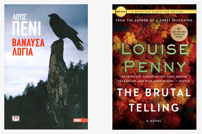
Off to Greece this week, with the cover of The Brutal Telling as envisioned by our Greek colleagues. There’s clearly a stark difference between the two cover treatments: while we chose to emphasize the fall season in our jacket approach, they focus on traditional mystery elements.
With the silhouette of a raven, their cover puts the reader in the mind of Edgar Allen Poe, and immediately suggests something sinister is afoot. In contrast, the US jacket focuses on the vibrant fall foliage of Canada, with only the darkness at the edges to symbolize danger.
Both jackets, however, speak to the untamed landscape that Chief Inspector Gamache must navigate to solve the crime.
Which cover do you think best fits the story?
If you were designing a new cover, which elements of the book would you choose to highlight?


31 replies on “Gamache Goes Abroad: The Brutal Telling”
The reference to the raven on the Greek cover evokes Gamache’s visit to Haida, the Charlotte Islands, off BC. It’s pretty obscure to have been chosen as a focal point in my opinion, but I kinda get it. On the other hand, the densely packed fall trees shows me two things: that there are references in the story to how soon all the leaves will be changing, and that the forest can hold and hide so much that might actually be within reach. I go with the trees.
Just finished the book. Left with more questions and urning to pick up next book for answers – hoping! I like the Greek version and now understand the Raven represents, although a very small aspect of Gamache’s visit to the Charolette Islands.
If I were to design a book cover I would think about so many aspects of this book that I wouldn’t be able to concentrate on just one. I picture an old printer’s drawer hung up and the camera focused on a portion. In each rectangle and square are different small objects that make the story whole – statue of a horse/moose, candlestick, fireplace, log cabin, one of the whittled carvings, and perhaps money for greed. Three pine trees and Canadian flag.
I prefer the Canadian cover — it reminds me of the setting of Three Pines but how under all that rural beauty there can be brutality. However, the Greek cover is haunting and I would be attracted to that as well.
It is interesting to see how some of the treatments are much more literal in their interpretation of the content. I prefer the more abstract — perhaps haunting or intriguing cover designs.
Having grown up in the very far south of Florida, I must admit that I never take the physical characteristics of each season to heart. I view the season to be as much a character as the human ones. It is so vital for setting the mood of the story. Especially in this book, autumn, for me, symbolized the fall of one of the characters and changing times and relationships. I, too, prefer the American/Canadian version, although I love Poe!
Although I like the Canadian version better, I really like @Michele H’s idea of a dark foreboding forest even better.
It doesn’t really matter. If it says Louise Penny on the cover I’m going to be drawn to it.
Canadian for me – the other is too creepy
The Greek cover is just sparse and ugly.
The Greek one. I think the starkness of the Raven is interesting and foreshadows Danger.
This is a tough call. The Greek cover catches the ominousness we feel all through the story; the English-language cover, to me, depicts the confusion in our minds (as the author skilfully steers us toward the wrong conclusions concerning the victim and his visitor). On a bookshelf, the autumn leaves would probably appeal to me more, but whatever the cover, the name of the author is the biggest drawing point.
I prefer the Canadian/American version of the cover as it does evoke the fall season in which the story takes place. Seasons are a big part of Louise’s books and paying tribute by adding some of that to the cover makes the book that much more enticing, taking us back to three Pines. I agree that a little cabin in a corner would enhance add some mystery. With the showing of fall leaves one can almost smell the smoke in the air, see the trees with the colourful leaves around Three Pines, hear their crunch underfoot and feel the change in seasons. Time for me to re-read this book.
My first reaction was I liked the ominous nature of the Greek cover. No mistaking it, this is going to be brutal. But, the longer I looked at the two covers, the more sinister the the U.S. cover seemed. The beautiful, rich colors of the Canadian autumn juxtaposed with the title becomes unsettling. What brutal telling is hidden beneath those trees?
Something must be wrong with me because the book covers don’t do much for me. Not just these, but all book covers. But the characters are part of my family.
I can feel their pain, I can feel their joy, and they handle their individual situations with such elan.
And although I am married, I too could marry Gamache, or run away with him.He is a man’s man, but he has a feminine “nashuma”. A yiddish word for soul.
And the bistro; we lived in Paris for a year, long time ago, and there was a bistro similar with two guys who ran it, and the customers who were regulars, and became like family.
I can dream of the little hamlet when I have had a trying day, and want to escape electronic gadgets, and phony people.
Waiting for the new one to get to my library.
I had forgotten about this book and after reading the synopsis, I must say it is one of my favorites for a couple of reasons. While all the books delve deeply into the characters, there always seems to be a strong camaraderie among them and they all “love” each other. There are exceptions of course – what happens with Clara and Peter; but this is different – Olivier’s lies, stealing and deceitfulness touches all of them so deeply, forgiveness becomes something they all have to work at. Gamache, who I would marry in a heartbeat, hates what he has to do, but knows he must do so. His compassion for this town and it’s people shines through. I agree with Judith about the cover – that scene – or the fall foliage with the hermit’s cabin sticking out somewhere. The Greek cover really doesn’t say anything about the story.
I like the Canadian cover. I’m rereading this one also. Love Penney’s writings. I was late to the game, so I was able to read the series without stopping. I like her characters. If they were real people, I’d love to live in 3 pines. My word to our favorite writer: WRITE FASTER!!!!!
I prefer the Canadian cover also.
I love all the book in the series, I love every characters, they have become family members. Louise Penny is such a powerful writer and all the details, smells scenes, I feel part of the village. With the pandemic and health issues I really appreciate even more your books I can escape in them so thank you very much. Merci beaucoup!
I like the Canadian American one too. So fun to think about these. They are like a sound track. You need them but you may not really notice them!
I don’t think either cover is very evocative of the story. If I were the designer I’d see if I could get the rights to a work by Emily Carr and incorporate it into the cover art.
So fascinating to see the differences in cover images!
Again this time, I prefer the Canadian/American cover – and it happens that I have just started reading The Brutal Telling for the 4th time.
It is one of my favorites of the whole series – mostly because of the story within the story, which is so powerfully written, and is what I might try to portray were I to design the cover. I’d stick with the fall colors, but perhaps have an open book in one corner with blank pages except for a hand-drawn, small figurine of “the boy” – with no words at all.
The Brutal Telling is one of Penny’s most powerful novels. A cover using the carving of the boat with the young man looking over his shoulder in horror would be perfect. It is the image that stays with me, year after year.