wcag heading
ALL THE DEVILS ARE HERE finds our dear Inspector in France so there’s no better place to kick off our “Gamache Goes Abroad” cover musings than en français!
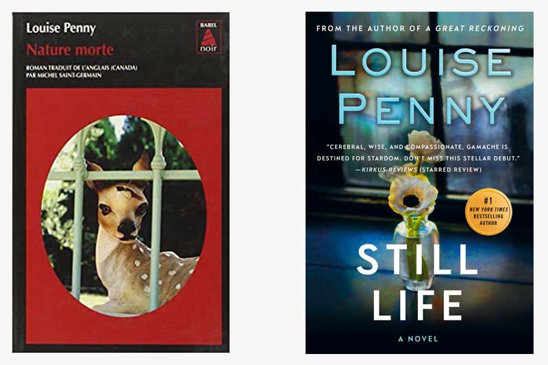
And, wow, the current U.S. cover treatment of Still Life couldn’t be any different from how our French colleagues handled the look of the book. While we opted for a subtle nod to the title — the art genre that dates back to the Egyptians — the French took a more severe route, depicting a key plot point (no spoilers, please!). It’s noteworthy that both covers feature framed imagery which could symbolize a window, or, entryway, into the series.
What do you think?
Which cover do you gravitate towards?


219 replies on “Gamache Goes Abroad: Still Life”
The French version is more ‘mysterious’ and striking – I love it
While the French cover is illustrative of the literal translation of the title, the North American cover is less stark and actually very pretty. I vote for the American version.
I prefer the English version because the artwork it is calming and subtle. For some reason when I look at the French version, with the coloring and the wildlife, and I think I would be reading a book on the subject of Christmas.
I like the American version best.
I find the print over the US cover image distracting, but at the same time the design seems more familiar and similar to covers I am familiar with in Canada. The French cover grabs my attention more.
The French version is more memorable – I have 2 North American versions, and can’t bring either to mind now that the pandemic has me confined far away. In the beginning, the French cover startled me (I’d read the English text months earlier and didn’t immediately see the relevance of the wounded animal), but in fact the French cover captures the multiple meanings of the title perfectly.
I definitely prefer the American version of the two covers. It leaves me feeling like there’s something beyond that window, beyond the peaceful little flower
The American version
Too much dwelling on damage and death of innocents for me in the French.
Love this series because life and light always finds a way.
The U.S. cover holds more appeal for me, and I find it more relatable to the title.
I like the US version. I read this book almost 2 years ago, so I don’t remember how the deer would be part of the plot as someone said that they prefer the French version because it refers to the plot.
Is there a Canadian version?
I prefer the blue cover (Or English version)
I’m not sure why or where everyone is coming from when they vote for the “US” version.
She’s Canadian you know.
If doesn’t offend her, it sure offends me. The gall to assume that if it’s in English, it’s surely American.
I’m Canadian.
Just because of the audacity shown here, I’ll vite pour la langue Français.
We spoke both French and English where I come from and we’re damned proud of it.
Pardon..”vote”.
Bravo, Carole-Ann. Louise Penny is one of a long and illustrious line of Canadian artists (film, music, TV, etc., etc., etc.) who have made their mark in the world and are usually considered to be “American” in the sense of supposedly having been born and having grown up in the States. The list is long and still growing.
The American version seems less confrontational, but perhaps because the red color is so stark. The French is intriguing but the American version is much more attractive, I think.
Not one to like change… I have to stick with the U.S. cover. Gently brings us into the series. ‘Course! Then the darn vase shatters!!!
I definitely prefer the American version. It speaks to me as an artistic version of the title while the French cover seems too “strong” and penetrating. I love interesting book covers and tend to study them often while reading a book. I think they are fascinating.
I like the original version
The American cover. But I bet if the French cover was put on ours when book came out we would have liked that one lol
I prefer the North American version for its: balance, colour, intrigue. The Gaelic version feels a little claustrophobic to me.
I prefer the North American version for its: balance, colour, intrigue.