wcag heading
ALL THE DEVILS ARE HERE finds our dear Inspector in France so there’s no better place to kick off our “Gamache Goes Abroad” cover musings than en français!
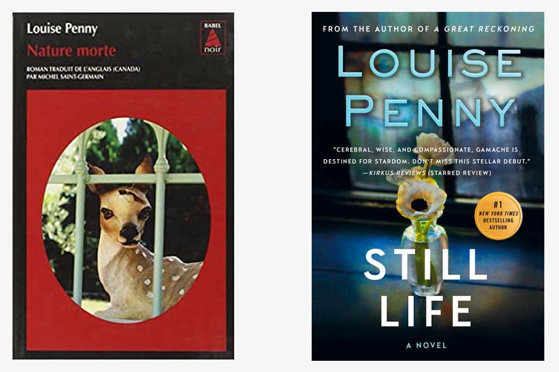
And, wow, the current U.S. cover treatment of Still Life couldn’t be any different from how our French colleagues handled the look of the book. While we opted for a subtle nod to the title — the art genre that dates back to the Egyptians — the French took a more severe route, depicting a key plot point (no spoilers, please!). It’s noteworthy that both covers feature framed imagery which could symbolize a window, or, entryway, into the series.
What do you think?
Which cover do you gravitate towards?


219 replies on “Gamache Goes Abroad: Still Life”
I much prefer the American version; the flowers in the vase depict a still life art work. The picture of the fawn in the French version looks unrealistic and eerie; the title “Nature Morte” (Dead Nature) does not evoke the same feelings.
The art genre of “still life” is “nature morte” in French. It has no more a negative connotation for the French reader than still life for the English.
I like the subtleness of the US version. It’s a still life art form. Are the flowers still alive once cut?… The French concept of a stll life of a fawn is fine but this particular image behind bars seems cartoonish, creepy, and garrish at the same time.
Love the French cover. Je voudrais bien le lire en franc,sis.
Aus, phone is anti French!!!
US version for sure.
Both covers are lovely in their own way. I like the extra subtle insite ….quiet, still, the fawn is hiding in plain sight which for it means a matter of life and death. Both versions of the cover are different from the copy I have (I am in Canada), which I believe was published in England.
I like the US version.
The US version captures me with its beauty, as so many of your covers do. The French version looks harsh and spy-novel-ish, which is fine, just not for me.
I like the American version. I adore all of your books. This will be fun.
Definitely the US version!
American Version. The French version is really disturbing.
Much prefer the American version!
I love the U.S. version! I really don’t care for the French one, I’m afraid.
Like many who have already stated it, I do not like the red of the French cover, so prefer the US one.
U.S. version is the one I would pick.
I would pick up the US version to read before the French. Would love to see a montage of all the covers.
French version
I have to say the American cover is my favorite. And I am always in favor of a cover that does not give too much away..just intrigues the reader!
Although the colors in the french version pop, which is appealing, the treatment is more two-dimensional than its cousin’s. The English version has a more sophisticated layout and use of foreground. It makes use of the entire cover surface, and tells a bit of the story all on its own.
I would like the French version better if the red was a softer color.
I much prefer US version