wcag heading
ALL THE DEVILS ARE HERE finds our dear Inspector in France so there’s no better place to kick off our “Gamache Goes Abroad” cover musings than en français!
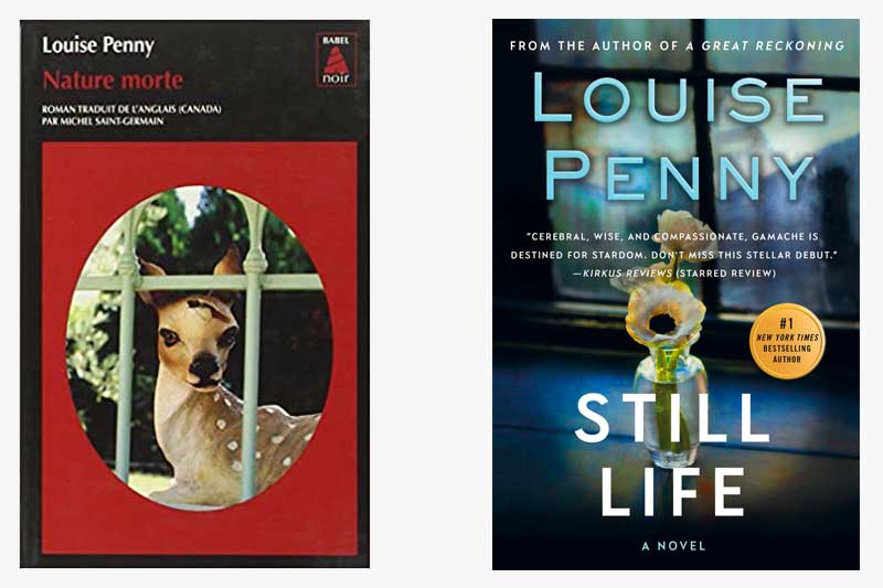
And, wow, the current U.S. cover treatment of Still Life couldn’t be any different from how our French colleagues handled the look of the book. While we opted for a subtle nod to the title — the art genre that dates back to the Egyptians — the French took a more severe route, depicting a key plot point (no spoilers, please!). It’s noteworthy that both covers feature framed imagery which could symbolize a window, or, entryway, into the series.
What do you think?
Which cover do you gravitate towards?


219 replies on “Gamache Goes Abroad: Still Life”
I love the American cover with the more subtle hints to it. But, the French covers is more creepy!
I’m with the person who said she’d read anything with the name Louise Penny on the cover. However, I prefer the look of the American cover.
In France the détective Book of Babel are Always in black and red…
I prefer the American cover. I am not drawn to the more stark contrast of the red and black on the French cover. Neither one is the American cover that I have, which features a rural scene with a white church and red barns.
The eyes of the deer disturb me. The American version is pretty but doesn’t represent the book to me.
I wonder if I might like the French version more if the fawn was realistic. A real fawn with soft glistening eyes and fur tinged in camouflaged browns, tans and creams. The French cover with the plastic looking bulbous eyes and fake felt-like fur are juxtaposed with the gorgeous metal window frame making a great contrast…. but that cheap plastic looking fawn would have repelled me from picking up the first in The Gamache series. A true tragedy!
I would actually like them combined – I love the broken deer statue but the read “window” cover is to basic/single color looking for a cover – I would like the deer sitting on the darkened window sill instead of the vase.
I prefer the US version shown above but interestingly, I have a US hardcover with a very different cover – it is a scene of a tranquil town (looks like New England where I live). It is an older copy, was it changed later?
The French cover is too red and an odd image, the other cover is much more subtle but neither hint at pictures I conjure in my mind when I think of Gamache and Three Pines
I like the French one because the image is beautiful and balanced, but I don’t care for the hole in the fawn’s head.
Any cover that has the name Louise Penny would mean I would want it
I prefer the American design. It is naturalistic yet goes from still life painting to still life as in dead.
I prefer the French cover with no review on it.
I like the US version. It seems more subtle.
My vote is for the French cover. The American one has too much text across the picture and, for me, is too “busy” because of that. Additionally, I am naturally drawn to strong colours which the French cover provides very nicely.
I like both, but am rather drawn to the sweet-looking deer. My own copy of still like has a cracked window with a spider on it. Can’t see that in the online version…
I like that the French cover is cleaner and very intriguing!
US version
French Version
I like the original version, US>