wcag heading
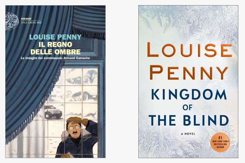
Buongiorno! This week, we find Gamache in Italy with the covers of Kingdom of the Blind. What strikes us about the Italian edition of the book is their literal interpretation of one of the opening scenes in the book, in which Gamache arrives at an abandoned farmhouse in a snowstorm. [Note from Paul Hochman: Who would have thought he’d drive a Jeep?]
Also striking about the Italian jacket is the illustration, which we’ve yet to see from any of the other international editions. Is their illustration of Gamache how you’d picture him?
In contrast, our US jacket takes a more abstract approach, while still evoking a wintry scene. It’s not hard to imagine that the icicles shown on the US jacket might be on a window, drawing similarities between our version and the Italian version.
What do you think? Which jacket do you prefer?
The illustration on the Italian jacket brings to mind a few other illustrated book covers. Does it remind you of any other covers in particular?


39 replies on “Gamache Goes Abroad: Kingdom of the Blind”
How do I preorder and get credit for my$10 deposit from a session several months ago?
I am drawn to the Italian cover. I have read, and thoroughly enjoyed, all of the books. When I think of Inspector Gamache, I am inclined to picture him as Michael Gambon, and the cover does resemble him a bit. Thanks for all the wonderful stories, and I am so looking forward to all the stories yet to come.
Yes- Michael Gambon but maybe 35 years ago.
To me, the Italian version is cartoonish… and no, Armand has way more substance than this cartoon character depicts. Someone already mentioned that the house he went to in the beginning of the book was ramshackle, he and Myrna questioned whether it would collapse if they walked inside… so how does the image in this cover fit into the story at all?
I agree, completely. Gamache is a distinguished, intelligent, tall, city man. Not this silly person peeking into an elegant home. I am put off by this cover. I read constantly and have read all Louise Penny’s books. She is an exquisite writer. This cover suggests a simple, silly, quick read.
Is their illustration of Gamache how you’d picture him?
Absolutely not. And he doesn’t look like Nathaniel Parker either.
The Italian version is, IMHO, too literal. This time I prefer the U.S. version
The US/Canadian cover, absolutely. Books tease the imagination perhaps more than any other medium. Why take away that ability to paint the world a book presents to us with our own brushes?
Fun to see this literal Italian jacket. The window dressing gives an austere foreboding aspect.
Buon Giotto
I prefer the icicles! Have never pictured Gamache with a mustache or looking like a prim English professor!
Can’t wait for September and your new book.
Gamache has a moustache in The Brutal Telling, p.16 second paragraph
The American/Canadian cover, no question. The Italian illustration seems wrong to me on two counts – one, the depiction of Armand (not how I imagine him at all) and the decor of the house, which is not a rundown farm house at all.
The Italian cover is appalling. Very cheap and nasty. No class at all.
Totally agree!! He looks like a ridiculous cartoon character – very South Park. Horrible cover.
Love our cover. It actually gives you feeling of a cold winter – which is when this great story takes place. And not just the Village, but also what Amelia has to do deal – bitter cold in the city.
I prefer the US jacket. My vision of Gamache is very different. I like my version better.
Absolutely love all the Gamache books and eagerly await a new adventure with all my investigating friends and cafe regulars!
I agree!!
Totally!! Love Gamache…
Ciao! Although I love the striking representation on the US cover jacket, I’m drawn to the Italian version with their interpretation of what our beloved Gamache looks like.
Arrivederci!
Inspector Clouseau!
Loved Peter Sellers in that role!!