wcag heading
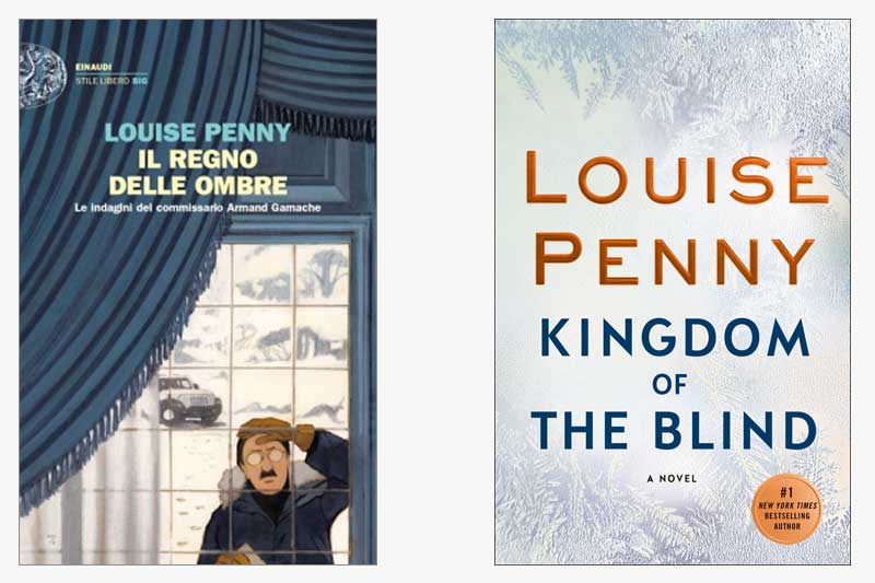
Buongiorno! This week, we find Gamache in Italy with the covers of Kingdom of the Blind. What strikes us about the Italian edition of the book is their literal interpretation of one of the opening scenes in the book, in which Gamache arrives at an abandoned farmhouse in a snowstorm. [Note from Paul Hochman: Who would have thought he’d drive a Jeep?]
Also striking about the Italian jacket is the illustration, which we’ve yet to see from any of the other international editions. Is their illustration of Gamache how you’d picture him?
In contrast, our US jacket takes a more abstract approach, while still evoking a wintry scene. It’s not hard to imagine that the icicles shown on the US jacket might be on a window, drawing similarities between our version and the Italian version.
What do you think? Which jacket do you prefer?
The illustration on the Italian jacket brings to mind a few other illustrated book covers. Does it remind you of any other covers in particular?


39 replies on “Gamache Goes Abroad: Kingdom of the Blind”
Loved this entire series. Read all in the last 3 months. Just finished All the devils, called our library to order the next one and found out it does not come out until August. Bummer! Can hardly wait!
I prefer the US book jacket. Until a movie is made of the series, I’d like to maintain my private vision of Gamache.
Thank you for bringing such topic into light, I really loved the concept of your article. Thanks for sharing this information. It’s a great source of knowledge; I think it will be helpful for lot of people who are looking for learning more about gamache goes abroad kingdom of the blind.You must also check out Beautifulblinds.co.nz it has some great insights too.
Love this author. Cannot wait for each issue.
I prefer the American- Canadian version.
The Italian cover looks like it belongs on a children’s book, not a Gamache mystery.
To see a movie of what he might look like watch the movie “Still Life” available on streaming.
The actor was not what I expected him to look like. Also I was not happy with the depiction of Ruth.
I much prefer the US version.
The Italian cover looks cartoonish to me and doesn’t match with Louise’s excellent writing.
I always picture Gamache as looking like the current Tom Selleck. The Italian cover doesn’t appeal to me at all.
It does look like Inspector Clouseau! Oh how we miss you Peter Sellers!
I have always pictured Gamache as looking distinguished and wise, sort of like a slightly younger Gandolph.
The Italian option looks like a bit of a mash of several stock art clips. Just not very serious and a little choppy. I love our US covers – abstract yet beautiful. Not cheeky, garish or cheap like many other series books.
Plus this is indicating that Armand is the one that’s blind. Not really how the book goes! . . . .I believe the book existentially leaves the kingdom as much more broad. We are all members of that kingdom but there are a few that are a bit less so 😀
Yes, it’s Clousseau! My Gamache is a little more of a hunk, just enough to match his heart throb personality. Love the wintry window that we can all peer through.
I really prefer the Canada/U.S. cover, it leaves more to the frosty imagination 🙂 The Italian cover
Gamache does not look like I imagine him,he also looks lost and bewildered ,which is not
Gamaches character. Looking forward to the next book!
I look forwArd to each new inspector gamach book. Louise penny always keeps me guessing to the end. Such a gifted author.
I looked at the Italian cover and thought, Who’s the peeping Tom? Definitely not Gamache and definitely not a ramshackle house. The North Am. cover with what seems to me to be frost on a window is both visually appealing and evocative of the story.
Thanks for showing us the variety of covers – it’s been fun
What interests me is the variety of covers. I really prefer ours this time. Different cultures – sale of book in other countries. No matter, the words inside are wonderful for us all!!
To me the Italian cover looks very immature ….like it is a picture book for Grade 6 or 7 . I cannot see it as a serious mystery novel . It almost has a cartoon quality to it . It would not invite me to buy the book unless I already KNEW that it would be good because I had read all the others .
The US/Canadian cover is much more sophisticated and invites ‘ conjecture ‘ as to what we ( as readers ) are in for .
I prefer the American/Canadian book cover. The Italian version does not match my vision of what the house or Gamache looked like. I agree with those who said that Ganache looked like Peter Sellers as Inspector Clousseau in the Italian version. We all know that Seller’s portrayal of Clousseau was clownish. This is the antithesis of who Gamache is.
I can’t wait for the latest book.
The us/Canadian cover more abstract, less cartoonish. looks good on a shelf and Louise Penny’s name is prominent
I definitely prefer the US/Canada version. To me, Gamache should look exactly like my late grandfather. Their steadiness, kindness, and personalities are very much alike. He didn’t look anything like the Italian version.
I like to imagine the characters, from their words, movements and the reactions of others to them. Thus I prefer the icy, fogged up, let me wonder cover.