wcag heading
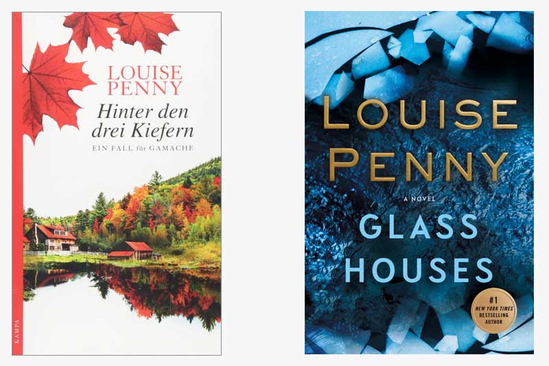
This is the second time Gamache visits Germany (see the June 9th post on A Rule Against Murder for his first visit). Interestingly, our German colleagues chose the title of Hinter den drei Kiefern, which translates to “Behind the Three Pines”, instead of the German translation of Glass Houses.
When we discussed A Rule Against Murder, we talked about the Germans’ decision to portray red leaves on the cover, which, as you readers have pointed out, is a clear reference to the Canadian setting of the series. Thanks to the keen eye of readers Marge H. and Leone S., we learned that the image depicted on the German cover for A Rule Against Murder was in fact the Prince of Wales Hotel, which is located in Waterton National Park in Southern Alberta.
The imagery on the cover for Glass Houses is similarly evocative of a Canadian landscape, depicting a farmhouse located on a lake. In contrast, our US edition is much more austere. While the image is ice, not glass, the cover evokes imagery commonly associated with glass: jagged and shattered.
Does anyone know where the image on the cover for Hinter den drei Kiefern is located?
A lot of you preferred the German edition of A Rule Against Murder to the US edition. Do you feel similarly about the German edition of Glass Houses? Which do you think best encapsulates the story?


15 replies on “Gamache Goes Abroad: Glass Houses”
Our service checks for plagiarism using the best plagiarism detection tools before any student receives their papers. Furthermore, each essay assigned to a writer is done from scratch by them.
While Three Pines – especially with the scenes set in the bistro – often comforts, every book in the series presents a dark side, within the village, within people, within an institution. And while the German title implies that side in its title, the image does not. Cute. Bucolic. Charming. Not this story – nor any of the others. So the more ominous picturing of shattered glass/ice seems more fitting.
I prefer the American/Canadian cover, which conveys the sense of danger and menace that permeates the story. Linda Anger’s comment about some people “frozen” in time seems right on.
Some of Louise Penny’s books were published before in Germany by a different publisher with – I think – not so recognizable – covers. Since Kampa (a publisher located in Switzerland) took over, all her books have this Canadian theme on the cover, the maple leafs and Canadian landscapes repeat on every cover.
I prefer the “maple leaf” covers, they make me feel welcome to enter one of Ms. Penny’s stories and thought is put into the series’ appearance.
But she doesn’t bucolic romance novels! she makes complicated mysteries that delve deep into human nature and people’s souls. The cute little scenes don’t give any hint about what we may find inside. Every cover has red maple leaves and cute little houses. I don’t understand……….
I prefer the American/Canadian cover – this story is darker than some of the others – some people “frozen” in time… the German cover, to me, is way to pastoral and calm for the content of the book.
Comparing the covers is difficult because the German version has a different, more bucolic, title. I found myself wondering why the house pictured wasn’t a glass house. But then I realized that there is no mention of the glass house in the German title. I like the blue cover because I think the title is a better title, so therefore the cover depicts it better.
I prefer the blue. It suited the story well.
Knowing that book covers are supposed to inspire the reader, the US cover provokes a question of “why is the ice/glass broken?”.
In the German version, I’m drawn to the country setting like your eyes would be pulled into a classic painting hung in a museum. Who lives there? Where is this located? And…why is it important to the story line?
Although not a Gainsborough () … I prefer the German edition’s cover.
As I’ve stated previously, I’m a fan of blue. I would pick up the blue book first and walk out with it from the book store. That being said, the autumn scene of the German cover is also compelling at a second look. It’s evocative of the aura of Three Pines and brings real comfort. I just wish the entire book cover was as artfully presented. The white contrast was a negative for me. Thanks again for the opportunity to participate in this format. ☮️
Well, the German cover is beautiful. Who can argue with Autumn trees mirrored in a pond? The other is suggestive of glass, but cold. Maybe the cover should have been some shattered glass and perhaps some stones! (Do I have a new career in cover design? Call me!)
I really love the German nod to Canadian roots of the story and author. I am reading that book next so I cannot comment on the story line but find it interesting how different markets depict covers and titles depending upon their demographics. Always an interesting discussion.
By the way, I am at home, recovering from an appendectomy, I had yesterday and could not have gone through today without Gamache and the Three Pines gang. Love you!!!
Beatriz
I believe some of Louise’s books have been translated into Portuguese. Have a look here: chave louise penny
Here’s to a speedy recovery!
Louise,
I am a huge dan of yours (on book 13 now and you just get better and better!!). My mom is Brazilian (so am I), but she does not speak English. She loves the genre and feels so jealous when I start gushing about a new book of the series I am about to start. Do you have any plans to translate your books to Portuguese from Brazil. I have a feeling you would do so well there!!
I started two of my neighbor friends here on your series and can influence a bunch in
Brazil, as well!
Your faithful reader and fan,
Beatriz