wcag heading
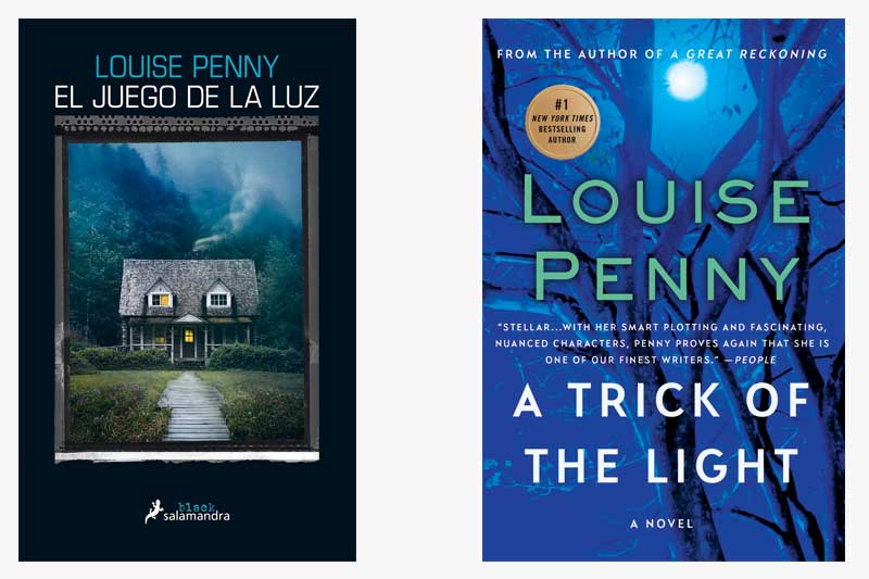
Today, we find Gamache in Spain, with the Spanish edition of A Trick of the Light, or El juego de la luz. Both covers play off the novel’s use of shadow and light to illustrate the suspense of the story. In both covers, the light filters through a tree’s dark branches, suggesting the juxtaposition between good and evil.
Note that in the Spanish edition, only half of the cottage’s windows are illuminated. This again might fortify the notion that there are two sides to every story. While the Spanish edition features a landscape of the cottage and its surroundings, our version zeroes in on a tree with very few leaves. Only when the branches are exposed can the light truly shine through.
The juxtaposition between darkness and light is a recurring theme in the Louise Penny canon. Which other books in the series come to mind when you consider this theme?
The plot of this book heavily features Clara’s artwork. If you were to design a cover for this book featuring her artwork, what would it look like to you?


26 replies on “Gamache Goes Abroad: A Trick of the Light”
The Spanish version is very eye catching and real. I love it (though I love every single thing about the Gamache books)!
I have always liked the tree with light shining through. With a quick first glance, I felt the front branch looked carved out, thus a good trick of the light.
A trick of the light. The house at a quick glance looks like an owl searching in the dark and then you realize it’s only a house with a foreboding look to either welcome you in or keep you away.
I like the cover of the Spanish edition, because it shows a cottage. I can’t recall if Clara’s cottage is of this construction; but much of this book revolves around Clara’s home, so this cover design seems appropriate.
Again, such wonderful comparisons to choose from.
This time I like the Spanish version El juego de la luz!
I love the moodiness of the cottage and the surrounds as well as the expectation that something is going to happen…and not end well.
Thank you for offering another intro to the next book by sharing how international publicists have chosen a variety of covers to draw in the reader!
I really like the cover of the Spanish edition. The cabin at first looks inviting and catches my eye. However, with a closer look, a cabin in the wood, a long walk to get there and with only half the lights on, it begins to feel more ominous…so it peaks my interest to see what’s there, but also warns me off. So I know this book is filled with suspense.