wcag heading
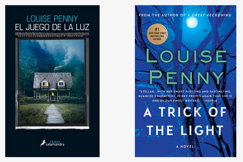
Today, we find Gamache in Spain, with the Spanish edition of A Trick of the Light, or El juego de la luz. Both covers play off the novel’s use of shadow and light to illustrate the suspense of the story. In both covers, the light filters through a tree’s dark branches, suggesting the juxtaposition between good and evil.
Note that in the Spanish edition, only half of the cottage’s windows are illuminated. This again might fortify the notion that there are two sides to every story. While the Spanish edition features a landscape of the cottage and its surroundings, our version zeroes in on a tree with very few leaves. Only when the branches are exposed can the light truly shine through.
The juxtaposition between darkness and light is a recurring theme in the Louise Penny canon. Which other books in the series come to mind when you consider this theme?
The plot of this book heavily features Clara’s artwork. If you were to design a cover for this book featuring her artwork, what would it look like to you?


26 replies on “Gamache Goes Abroad: A Trick of the Light”
The same request is only 3 dollars more! Naturally, this doesn’t mean we can’t produce your order in a swift fashion. When you do business with us, we guarantee that your high quality paper will be completed in time no matter what!
If I were to design a cover…. at first I thought of the portrait of Ruth as Mary but then I realized what I would envision as Ruth is individualized by my past interpretations of a bitter elder woman. Then I thought about the white dot – in her eye. The light of hope and might think about a picture/sketch like Peter’s art work – an up close picture of a pupil with The tiny speck of hope with something everyone could interpret as hope for themselves.
This time, no excuses, I really, really prefer the beautiful blue cover. An English-language version. And all the illumination in this cover image comes from *reflected* light. Appropriate and symbolic.
I prefer the US cover – more evocative of her life work. The Spanish cover is just a bit too mundane, I think, for a Louise Penny story. I do agree with Patti that the text detracts from the cover. A cover based on Clara’s artwork: Ruth, of course.
I prefer the Spanish cover in this instance. Although I deeply appreciate Louise Penny’s artistry in evoking the nuances of ethics, morality and psychology in her complex interplay of characters, to me her evocation of setting is what anchors me into the stories. The Spanish cover includes both aspects, and draws me more through the implication of humanity, tinged with a hint of potential dark foreboding. Whereas the other cover is beautiful and symbolically nuanced, it is “colder,” with no social context. Without the deeply rendered relationships and community these books share, I would not be as avid in my fandom.
It would not fit the general appearance of all the series’ book jackets (at least, not the U.S. ones), but I’d have tried a cover image that looks past the back of a canvas, still on its easel, toward a half-open studio window. Moonlight comes through the window, picking out an overturned work table and spilled paints, brushes, pallet and liquids on the floor of the dark-shadowed room.
I prefer the American covers…not only for this book but also the others. I enjoy the subtlety of the US covers…they are not a stark, set pictures. They are softer to look at, yet have an air of mystery…”un sous-entendu”.
The moon on the American cover made me think of the spot of light, the hope, in the eye in Clara’s painting of Ruth as the Madonna. A full moon always seems hopeful to me being the most light we can ever get in darkness.
The US cover is more sophisticated and the artwork is extremely better than the Spanish version. The Spanish version seems so blah and with the exception of the darkness behind the cottage it looks like a typical British cottage 1950 mystery book. Because there is always something deeper in Louise Penny’s books than just the mystery to solve of it, like conflicts in the lives of the characters, the Spanish simplicity just doesn’t do it for me and and it not representative of the overall complexities of the characters and the mysteries themselves. Going through the jagged tree limbs to the light is much more complex than just looking at a suggestive house that might look like one in Three Pines.
The swirling deep blue cover with the moon providing the light brings high interest to me immediately. In contrast, the other cover brings to mind terror and fear. When I read the Gamache series, I rationally understand I’ll encounter and feel strong terror and fear. However, I’ll manage to get through that because I’ve been taught by Louise and Armand that goodness abides. Thank you Louise for this desperately needed message for our world. ☮️
I’m with Patti, too much text on the US version….otherwise I might prefer its image. As published, I prefer the Spanish version for most of the reasons others have given….And I LOVE that you are offering these comparisons!
Definitely prefer the Spanish cover! There just seems to be too much text on the US version to be able to focus on the actual cover photo!
I like the cottage, because it helps me to visualize how part of the village looks. Overall, I feel that the US covers are quite artistic and lovely; I mostly favor them. I guess I’d like to see pictures of the village because my imagination cannot get the look of the village green and the surrounding businesses and homes quite in perspective. And I realize that one great aspect of reading is to develop my personal visual images of the story. Perhaps the planned series by Amazon will fill in the blanks in my mental image? (Although moving favorite novels to film creates lots of anxiety. Trusting in Louise’s gifts for creating such a lovely spot!)
I like the Spanish version. It has a contradicting appearance. The one unlit window and slightly crooked path is a little unsettling. At first glance, it is cozy….
I’d like the painting of Ruth as Madonna
A cover based on Clara’s artwork? How about a closeup of a corner of an oil
painting, with a drip of red and a tiny reflection of light/tiny spot of white on the drip
I have to agree with Patricia and Jeann Cetera. The lighting on the branches of the U.S. cover seems to come from several directions. A mystery. Plus the light of the moon is blurred. Maybe not as illuminating as one might wish.
I like the U.S. version. We know that eerie things can happen during a full moon.
I prefer the simplicity and elegance of the U.S. edition. It’s both ominous and illuminating, the dark branches stark against the light. The Spanish edition, while working to be ominous while providing the seeming comfort of a cottage – is just a wee bit too cute for me.
I like the American cover. The light on some of the branches is coming from the left, and they are very dark on the right side.Yet, what I take to be the moon is behind the tree, and then, some of the branches are looking as if they are in twilight. Light can not come from three directions at once thus the trick.