wcag heading
This week’s installment of “Gamache Goes Abroad” leads us across the Atlantic to the United Kingdom for A Great Reckoning – which is perfect, because the title comes from William Shakespeare’s “As You Like It.”
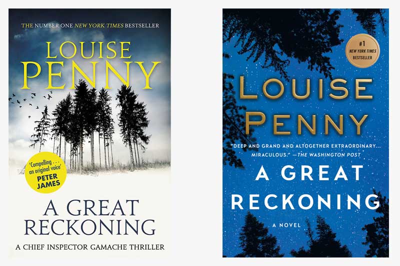
Both jackets depict a group of trees – a theme we’ve seen throughout the series — but what stands out with these two is the sky. The UK version highlights a dark, cloudy sky punctuated by a group of crows (referred to as “a murder”), perhaps alluding to the secrets hidden inside the Surete Academy when Gamache arrives. The US version, conversely, focuses on a night sky filled with stars, which could symbolize Gamache’s bright influence on the school.
As we look at the US cover and think about the Shakespearean influence on the book’s title, the phrase “star-crossed” comes to mind, which speaks to the theme of destiny, a major component of the book.
What examples of destiny are evident in A Great Reckoning?


14 replies on “Gamache Goes Abroad: A Great Reckoning”
I to am a day late to this discussion. I prefer the US version. To me the trees are very dark and menacing. I have always liked the way as darkness falls all the trees turn black. And yet you know that in the morning they will be back to their bright green again.
A day late to the discussion; the brilliant deep blue stands out from the other books on a sales table, calling your eyes to it. It has a three-dimensional feel. It is also not a pleasant daytime blue, but a night one. On the other hand the “murder” of crows is a nice touch, the trees look sparse and unhealthy which is telling that there is something not good inside the book. I wonder if taking the illustration of the UK book, enlarging it slightly so the images stand out more and putting it on the blue background would be the best.
I also am drawn to the UK cover. I think it would draw a new reader as well. As usual, I think the US version has too much language. I tend to like a sparse cover. I too am fascinated by crows. The color blue that is used for the cover makes me think almost a tropical setting.
I do not, however, like the font on the UK cover. Picky picky! So nice to discuss with other Louise Penny fans.
As with most of the book jackets in this series, I much prefer the non- US versions.
UK version for me. I like the pines themselves. Different from the welcoming three pines…And I agree with the thoughts on the murder of crows. Loved this book. Only weeks to go 🙂
A group of crows – a murder, very Clever UK!
I like that!
I am looking the US version. I like the looking up aspect and the trees work better for me. They are deep, dark, and forboding.
UK version is the winner for me. Foreboding. I feel a frigid wind, and I stand there shivering.
I prefer the U.S. version. Somehow the few, thin black trees, the crows and moody sky of the UK cover didn’t speak to me as did the vast, star-filled sky, seen as might be seen by a person not just looking up – but perhaps lying on the forest ground, contemplating and humbled by the vastness above. Resolution. Realization. A great reckoning, indeed. (And a grand book.)
I’m surprised that I prefer the UK version. I’m a blue person and I like stars also, however the crows and trees called to me mysteriously. I even tried to talk myself into the blue cover; alas, UK won out. Have a good week everyone. See you next week.
I do like the U k version as well. The other cover looks oddly maybe too cheerful. The UK has a “something is” coming feel to it.
I’m drawn to the symbolism of the “murder” of crows in the U.K. version. Also how students tend to flock together. I also felt perhaps the trees represented the school, which was remote and the U.K. version made me think of how remote the school was, how remote his former friend and colleague was when Gamache went to see him. Lots of symbolism in this jacket.
I had to look up the quote again, “ It strikes a man more dead than a great reckoning in a little room.”
William Shakespeare (Epigraph, A Great Reckoning)
And I reread The Cultural References in the link
cultural-inspirations-from-a-great-reckoning/
This time, it’s the U.K. version that I am drawn to with the stand of trees and the murder of crows flying in the sky…so very symbolic!
Thanks for pointing to the Cultural Inspirations, Michele!