wcag heading
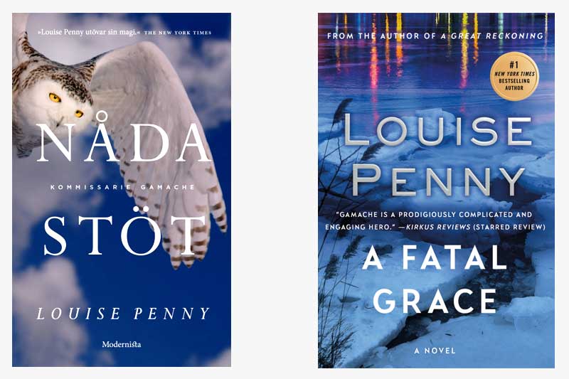
In this installment of “Gamache Goes Abroad”, we find our dear Inspector in Sweden, where our Scandavian publishing colleagues decided to call the book “Nådastöt”, which translates to “Death Blow”.
One of the first things we noticed is the similarity in color palette between the two covers. Even before reading the plot description, it’s clear that this is a book that takes place in the cold Quebec winter.
As for differences between the two covers, the US edition focuses on a landscape image (and major plot setting), whereas the Swedish edition depicts a snowy owl, which is said to symbolize sacrifice, family, clarity, and legacy — attributes which surely apply to the Three Pines canon.
If the two books were side-by-side, which would you be more likely to pick up?
Beyond a frozen lake or a snowy owl, what other images represent winter in Three Pines to you?


85 replies on “Gamache Goes Abroad: A Fatal Grace”
Side by side, I would pick up the owl first. However, I think the US version is more in keeping with the contents of the book.
If the Owl was on the English version I would buy it because it is graceful and fatal. Don’t read Swedish so don’t understand the translations of the English title. The colors are good choices too.
I love snowy owls also, but I do not like the title “Death Blow”. Even though you write murder mysteries, as mentioned by a previous reader, your books go way beyond this almost secondary plot. Your character development of our 3 Pines families is more in the forefront to me. The more subtle illustration and title “A Fatal Grace” calls to me to read this book to find out what this title means. My vote goes to the American version.
Were they side-by-side, I would’ve picked up the owl. The owl looks as though it’s in attack mode. A kind of scary murder mystery. And I love the colors of both books.
I would grab the US version largely because it features your name in big, honkin’ capital letters!!!
Ditto!
The owl is beautiful, but the title change loses the foreshadowing that there is much more contained in the story than murder and brutality. There is grace. All of your books offer so much more than an intriguing mystery.
I much prefer the US cover. I love owls, but this one doesn’t speak to me, perhaps because I am not Swedish. It is beautiful, but seems irrelevant.
I would choose the US version. The owl is beautiful but it reminds me of a self-help book. The US cover reminds this Florida girl of home in New England.
Both covers are great and I appreciate the meaning behind the snow owl, but perhaps it’s too subtle.
I’m so used to the US version and the landscape cover draws me to the book, wondering what’s going on.
Another vision of a wintery Three Pines would be the bench covered in snow with a lone person trudging his or her way to get to it…or trudging away to get to the Bistro for a hot chocolate!
I would have certainly picked up the US version. Only because, as you say, it reminds me of a very cold Québec day. P.S. Can’t wait until September to get the next installment of my favorite book series.
I would pick up the one with the owl on the cover. I can’t wait until the new edition comes out. Louise Penny writes beautiful books . You get totally immersed in her characters and the story. As long as she continues the series I will be first in line to purchase one.
I’m a push over for snowy owls, so… but the design does feel a bit out of character for this series.
I prefer the US version; slightly ominous with a hint at the brutality af winter.
I like the US cover. To me it is the more appealing of the two. I like the colors. It reminds me of a winter’s day in Quebec. Since I am not Swedish the owl means nothing to me.