wcag heading
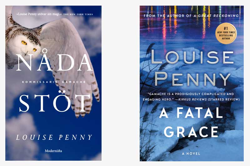
In this installment of “Gamache Goes Abroad”, we find our dear Inspector in Sweden, where our Scandavian publishing colleagues decided to call the book “Nådastöt”, which translates to “Death Blow”.
One of the first things we noticed is the similarity in color palette between the two covers. Even before reading the plot description, it’s clear that this is a book that takes place in the cold Quebec winter.
As for differences between the two covers, the US edition focuses on a landscape image (and major plot setting), whereas the Swedish edition depicts a snowy owl, which is said to symbolize sacrifice, family, clarity, and legacy — attributes which surely apply to the Three Pines canon.
If the two books were side-by-side, which would you be more likely to pick up?
Beyond a frozen lake or a snowy owl, what other images represent winter in Three Pines to you?


85 replies on “Gamache Goes Abroad: A Fatal Grace”
I would pick up the US version because it has the ominous visual quality of a tantalising mystery. The Swedish edition looks like a natural history book to my North American eyes.
I would be more intrigued to pick up the U.S. cover. Depicting an evening scene with a pond that is covered with ice and snow, which may contain someone who fell into the bone chilling water. It conveys more mystery and congers up questions about what the pages within may contain.
I would pick the US cover, since I can’t read Swedish! All kidding aside, as long as it’s a Louise Penny book, I would pick it. I love her character development as much as the mystery itself!
I love the blues of both covers. However, my favorite is the US cover. I like the contrast of the bitter cold broken ice along with the hopeful delicate colors that are reflected at the top of the cover.
I like the snowy owl—it brings to mind the concept that even in the cold dark of winter there are preying eyes watching . . .!
I love her books. She introduces so much common reality to her characters and settings. The owl seems a bit too stylistic to me. I prefer the US cover.
The idea that grace could be fatal is intriguing, so that title appeals to me. It reminds me of Flannery O’Connor’s references to grace.
Although I love pictures of owls, I prefer the bit of color and the reflection in the American cover
The US cover.
While the Swedish cover is beautiful and I love the owl, it doesn’t have that ominous aura I would expect to see on a mystery cover.
Were I two, I would choose both. Independent of language, the snowy owl is utterly elegant,
strong & purposeful. The woodsy scene with light refracting, is people and humanity. In life,
all exist. This is mystery.
I like the U.S. cover. To me, the title of the Swedish edition makes it sound like someone was hit with an object which is misleading. The U.S. cover is more “atmospheric,” and I tend to relate it to the tone and environment of the book.
I like the US cover; it has ominous undertones. The owl looks more like a nature book than a mystery novel.
I prefer the North American version. I think it’s the lovely colors — the blues and the distinctive flashes of bright colors at the top.
Having the awareness that both books are the same, I’d pick up the cover with the snowy owl first to admire the owl. However, I’d then look at the US version to compare. I would be intrigued by the icy pond and the intrinsic beauty that unfolds. Therefore, my choice is the US version. Another poster commented about Louise’s large name that is prominent. I like that. Does it mean for Americans you need to splay it out there to be noticed? Sadly, there’s so much competition out there, maybe that hits the nail on the head. Ouch! Love these weekly opportunities for our votes. Vote early and often…
I would have picked the book with the Snow Owl on the cover. Although I thoroughly enjoy the Gamache series, I most often select books because of something about the cover that appeals to me. Cold icy water scenes give me the shivers…symbolically. Yes, that cover is in keeping with the book’s theme. But I love the Gamache books for the characters, and confess that I have a tendency to read through the darkest parts rather quickly.
I prefer the American version! Both versions of the novels have similar jacket covers in the same lovely blues & whites ! Distinctive covers are lovely!
I would have – and I did – picked up the American version. Although I am confused as to why it is not the referred to as the Canadian version. I like both covers, but the symbolism of the owl is too subtle for me. I would have thought that the owl was an eye witness to the unfolding scene below. I prefer the American title as well. As brutal as murder is, it is only a part of Louise’s story telling. And finally I really like that the authors name is so prominent. I have yet to visit Quebec, but I visualize a winter’s scene with a stone cottage, snow on the ground and drift piles up against the cottage, three pines in the distance, where a lone figure sits on a frozen bench and the cottage windows, lit golden from the fire inside, beacon in those who are out in the cold.
I like the US version. It foretells the atmosphere of the story.
Even though I’m Swedish I do prefer the US cover.
But regarding the title, “nåd”, in “nådastöt”, actually means “grace”. And the translation of nådastöt according to my dictionary is rather “coup de grace”, which seems more fitting than death blow.
Thanks for that clarification, Ingela!
In that case, it’s a pretty perfect translation.
Yes, more in tune with the subtleties, complexities of the books.
I’m an owl lover so I like that one.
I like both covers, but it is the title that would attract me this time. There is little mystery in Death Blow. I love the name/word Grace. Juxtaposed with the word “fatal” I am intrigued and unsettled. I want to know what grace, who has it, why fatal. It’s a wonderful title.
I agree with you 100%!
Me too
I agree with you! The title Fatal Grace draws me in as much as the artistic part of the cover. I also agree that the mood of the book is better portrayed in the US version. It may just be that our cultural aesthetics help us lean more one way than the other. When I look at the cover of the US version, I feel cold but can still appreciate the beauty.