wcag heading
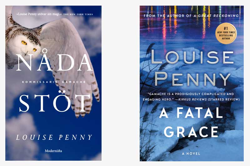
In this installment of “Gamache Goes Abroad”, we find our dear Inspector in Sweden, where our Scandavian publishing colleagues decided to call the book “Nådastöt”, which translates to “Death Blow”.
One of the first things we noticed is the similarity in color palette between the two covers. Even before reading the plot description, it’s clear that this is a book that takes place in the cold Quebec winter.
As for differences between the two covers, the US edition focuses on a landscape image (and major plot setting), whereas the Swedish edition depicts a snowy owl, which is said to symbolize sacrifice, family, clarity, and legacy — attributes which surely apply to the Three Pines canon.
If the two books were side-by-side, which would you be more likely to pick up?
Beyond a frozen lake or a snowy owl, what other images represent winter in Three Pines to you?


85 replies on “Gamache Goes Abroad: A Fatal Grace”
As a true mystery/suspense/horror reader for the last forty years I have to say the cover is what sparked my interest in more than 75% of the books I read. And then the quick blurb. However my local librarians told me about Louise Penny so I am reading the series other wise it would have been chance me coming across one. I prefer the US version – more mystery in it – setting the scene. The symbol of an owl to me means teacher or a snow owl reminds me of animal videos growing up of them attacking rabbits in snowy fields. Too deep of a symbolism can get lost in a person’s quick glance in a used book store or library.
The US version is more intriguing, the owl is beautiful but sort of blatant, and doesn’t connect with the story.
I’d be hard pressed to choose if I was in a rush to pick if they were both as presented and I could read both readily, but I think must go with the lake . I can only read English and the owl wouldn’t be right with a larger title.
Sorry for that run-on sentence!
I prefer the picture on the US cover however, again, they’ve spoiled the cover with too much text. It’s intrusive in my opinion. the image should draw the reader into the book, persuade him/her to read it. But all the words disturb the process for me, though because it’s a Penny book, of course I would read it despite my antipathy to the cover.
Both good covers. I especially like the how clean the Norwegian cover is vs the fussy cover of the US cover. The owl is quite eerie and I really like what it stands for (thanks for the explanation, Louise) but the US pips it – snow ❄️ love it! Really prefer quotes etc on the back cover or inside and that would have made it (US version) a runaway winner. Colours good on both. Also, once you’re reading/have read the book US cover is more in tune with the storyline. Finally, prefer US title Fatal Grace – far more Gamache than Death Blow! To my mind anyway
I prefer Swedish version. Very mysterious!
The owl made me choose the Swedish version.
I like the Swedish cover a bit more, but the English title is far superior.
Having learned a more poetic translation of the Swedish title I like it much better. A Fatal Grace is such elegant language though.
I love the owl, especially with the clarification of the translation as coup de grace. Reminds me of the poem by Mary Oliver “White Owl Flies Into and Out of the Field” which is also about death and grace.
Looked up “Nådastöt” online, and found it translates to “coup de grâce.” As for the book covers, it’s the typeface I prefer in the English version, and the sparkly lights at the top. No comment on which version better represents the book’s contents.
Just went a bit “deeper,” at least into the internet. Would be nice to know how a Swede understands the title. Looks as though “nåda” can mean “grace,” and “stöt” can mean “shock,” possibly as in “electric shock.” Or maybe “blow” as in “death blow.” Fascinating.
Visually I like them both. Perhaps the American one grabs the eye a little more with the addition of color at the top if the picture. What would get me to buy it even without any picture is your name featured prominently. I look for each new addition.
I like the Owl motif providing they have author’s name and English title. Like the dark blue background and majestic owl. Owls represent dark and mysterious to me. A background of three tall pines and a bench reminds me of the Village Of three pines…beautiful,majestic, foreboding in the winter, and wild in the other seasons, of another world from long ago.
I vote for the owl but with the english title.. but that’s not an option is it?
I would definitely choose the US one – it gave me the real “feel” for this novel – and, by the way – I am ANXIOUSLY AWAITING NEWS of a new novel – I’ve avidly read all of the others and need MORE!! Wonderful series, for anyone unaware of the fact, and I’ve recommended them to all of my friends, including TWO that are Canadian – and I’ve asked them what a couple of words meant AND even tried making some of the food they were eating – I’ve NEVER had BRIE with eggs before but now ….
Both attractive covers, but the owl just doesn’t seem to go with the book. I also prefer no close-up faces on covers…animals or people.
The English title means more (to me) – until I read Ingela’s comment, which clarifies the idiom. And I also love owls. I didn’t know the Swedish symbolism. I think of “I Heard the Owl Call My Name” and that symbolism makes sense to me.
The snowy owl doesn’t speak to me as much. I didn’t understand the reference, tho I like owls.
Guess I would have chosen the US cover. But, what I know is…..if it is a book that I want to read I am not so concerned with cover. But author has to be, so 5his is an informat8ve query.
I would also go for the snowy owl, it really made quite an impact on me!!
Really like them both, maybe mix it up!
Just get them out to us readers, I can’t wait to read.
I like the U.S. cover but love the Swedish title, “Death Blow”.